April 18, 2010

A Wine Bottle Marriage

How beautiful are these? Have you ever seen a wine container made like it's art? I look at these and my eyes find peace. This concept came from Athanasios Babalis -- an industrial designer out of Greece and his other work is just as elegant... lots of clean lines and shapes with ample qualities of placidity. Just gorgeous. However, these gift boxes are my absolute favorite and so unique! Wish they were more readily available though, because they make the perfect way of presenting wine. A proud way of giving.


April 12, 2010

Just Being Self-indulgent

Every time I see this dress, I drool. Milly is one of my favorite designers out there because of her fabrics (they are always brilliant in colors, striking in their graphics and then she compliments them with special beads... ever so individually placed). You feel like you're in Palm Beach when you wear one. I have a couple of her dresses, but I've never paid full price for any of them (the one below sold for $400). So, my new thing now is: I WANT TO SEW!!

Although I need to find a course on how to do it first--and if I can--I could use that time to make one of these. This very same one! How rewarding that would be!! Making this maxi dress can't be so hard, right? Is there anyone out there who can help me with locating a pattern which mirrors it?

I'd love to learn how to sew tunics, summer dresses and maybe even skirts. How fun! I really never cared for the idea of anything to do with a sewing machine before, but after several years of slowly getting addicted to watching Project Runway--how could I not catch the sewing bug? All I can do right now is a button (which I learned on YouTube) thus I know my road ahead shall be long... but what a skill to have at some point in your life!


March 26, 2010

A Lone Star Spotlight

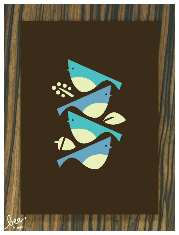
Whenever I come across birds, for some reason I pay a little extra attention since some people write my nickname birdy instead of berty. I stumbled on these screen prints this morning and I thought you might be interested to take a peek at their other work over at Bee Things. They're located in Dallas, Texas and I just love their style. They also have the cutest brown bags that are great if you have kids or even if you don't (like me). Bagging your lunch has never been so adorable! Check out all their goods -- they are très bien!


March 22, 2010

Leave It To The English

My motto has always been that good coffee and great design make the best of marriages -- however, I am discovering a new teeth-staining focus... which the UK is ill-famed for. Let's face it, they know their teas and now they have a neat new tin. Williamson Tea does, actually. Just saw these on the dieline and had to share. What a great thing to save and hide your greenbacks in (which would be quite fitting, really, since elephants are a symbol of good luck). Wish I could get my hands on a pink one... or the green. I have a tendency to collect. :)


February 22, 2010

An Oldie But A Goodie

Dockers has a new campaign out for men. Nice use of typography and although it's not a new concept using type as the body's silhouette (which, by the way, is terrible if you read the message), I can't help but admire the way they did theirs. It's so eye-catching I hardly noticed the khakis that they're trying to sell!


January 30, 2010

New Ways of Reading

How clever is this? This is a nice little product from what looks like a nice little company called twelvesouth. I love it for personal use because you can hide it away if you leave it at home... and there it shall lie safe within your library. Now, aside from it being well made, it's also a really nice price (considering how much interesting laptop bags go for these days). Pretty good out-of-the-box thinking on this one if you ask me!


January 22, 2010

Newbies

I'm always paying attention to refreshing things being posted out there and saw these newbies this morning and thought I'd share them along.

This wine label (made by an experienced labelmaker) was screen-printed and named after the country’s international phone code. The font is based on the one used by the Bulgarian Post in the 1960s. A selective transparent UV matt varnish was applied on the pattern of circles around the logo against a glossy background--and then a transparent puff-up varnish on the +359 logo to create the appearance of wave lines. The label is also bordered with a glossy hot foil stamp and there are some tiny hot foil dots around the logo as well. Turned out really fun looking!


I found this label's technique interesting too. It was a seasonal greeting of
spiced mulled wine made for clients and friends from a design firm over in London called Buddy. Their Christmas wishes were pad printed matt silver directly onto the bottle glass (the design being suggestive of measuring jug graphics). The concept went: the more you drunk the merrier the message. Very festive, indeed!


January 4, 2010

The Junk That Gets Made

I was going through my email and found this. Totally forgot to post it from way back last spring when my best friend was visiting me from Hawaii. She and her husband stayed at this old hotel in Kenmore Square and in the room was this hilarious, unforgettable bar of soap. I think we gawked and examined it for an hour because none of us had ever seen such BAD DESIGN!

What we couldn't figure out was: on the packaging it boasted about being "green" and saving the environment, blah, blah, blah, yet the waste it produced by the expensive die cut of the box and eliminating the center of the bar of soap itself! "Waste reducing"... hardly.

Whoever thought it to be clever to die cut a hole in a small bar of hotel cheap soap so you can put 3 fingers through it?? I wish my clients were so care-free with their budgets to allow such madness... for I could put it to much better use.


December 20, 2009

Visionary Cardboard Boxes

This one can't go without sharing before I head out on holiday. Came across another awesome and innovative concept coming out of Oz. A design firm in Melbourne, Australia, have designed a Perforated House!

"The use of operable walls, doors, curtains and glass walls enables the occupants to change the experience and environment. This architectural manipulation of space blurred the boundaries between inside and outside, the public and private realm. The manipulated spaces overlapped and borrowed the amenity and context of it’s surrounding environment." -- KUD


December 13, 2009

An Interesting Catch

I'm aways looking around to discover talented work being done inside my favorite mediums because it's the best way to inspire my mind and motivate me to work. I found some new silkscreen styles that looked good to share due of their use of contrasting color. Also found a couple of interesting ways to use script which, by the way, look almost exactly like something I did way back in design school years ago. I'll see if I still have that around so I can scan it and show it to you. Hoping I do.


Now the script. I keep looking at this and wonder if nothing is really that new when it comes to conceptualization -- that it's just been recreated, recycled, reconstructed, redesigned by someone else's different perspectival mind. So many decades of creative thinking going around the world and back. Our unconscious mind sees many things, who's to know how it collects it all? Just uncanny that this first and second poster below are not only doing that, but they also came out of Australia. Kind of interesting to me.